→peil.nl: Reply Tag: Reply |
→peil.nl: 3RR Tag: Reply |
||
| Line 365: | Line 365: | ||
::::::Regarding point 3: I don't see your point here really. [[User:Dajasj|Dajasj]] ([[User talk:Dajasj|talk]]) 19:11, 18 November 2023 (UTC) |
::::::Regarding point 3: I don't see your point here really. [[User:Dajasj|Dajasj]] ([[User talk:Dajasj|talk]]) 19:11, 18 November 2023 (UTC) |
||
:::::::And to be clear, I don't propose removing the poll from the table. I ''simply'' don't want it to be highlighted in a bar chart. Because that was irresponsible to begin with and even more so with such an outlier. [[User:Dajasj|Dajasj]] ([[User talk:Dajasj|talk]]) 19:16, 18 November 2023 (UTC) |
:::::::And to be clear, I don't propose removing the poll from the table. I ''simply'' don't want it to be highlighted in a bar chart. Because that was irresponsible to begin with and even more so with such an outlier. [[User:Dajasj|Dajasj]] ([[User talk:Dajasj|talk]]) 19:16, 18 November 2023 (UTC) |
||
::::::::Please read [[WP:3RR]] and restore the chart. [[User:Uwappa|Uwappa]] ([[User talk:Uwappa|talk]]) 19:32, 18 November 2023 (UTC) |
|||
Revision as of 19:32, 18 November 2023
| This article is rated List-class on Wikipedia's content assessment scale. It is of interest to the following WikiProjects: | |||||||||||||||||||||||||||||||||||
| |||||||||||||||||||||||||||||||||||


Language
Hey, I do not really edit wiki pages so I don't want to interfere with your stuff, but I would suggest to replace the word "fuse" with "merge". — Preceding unsigned comment added by 86.92.89.111 (talk) 11:47, 19 April 2023 (UTC)
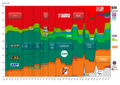
Color blindness nightmare
Hi, the graph showing the ups and downs of each party is impossible to be read by a color blind person. Please lets make wikiPedia more acessible. Color blindness is not rare among men (15% of men have some degree of it). If the graph contained a small arrow wih name of each party it would be helpful 85.147.184.52 (talk) 17:52, 15 April 2023 (UTC)
- Good call. But not easy to solve. The spaghetti caused by the multitude of parties, the dots to represent the different polls make these graph very hard to read even for people with very good colour vision. There are only so many colours (I once heard about 5-7) that are sufficiently distinguishable to use in a graph and the number of parties in this schem goes way beyond that. In addition colour schemes seem chosen to be as close as possible to the self-chosen party colours so that may be part of the problem. Ideally we should indeed apply some kind of additional distinguishing features - like dashed, dotted or otherwise distinguishing lines. Arnoutf (talk) 19:28, 15 April 2023 (UTC)
- I'm certainly willing to implement some improvements, however it really is hard to come up with a good solution. Sure, dashed lines could be a part of the solution but it certainly doesn't solve the color blindness issue on its own since it's impossible to come up with 17 types of lines. Additionally, I don't really believe in a solution like this, since very often, multiple lines end up on more or less the same spot and then the assignment becomes ambiguous. Gbuvn (talk) 19:36, 15 April 2023 (UTC)
-
 stackedarea
 -
 stackedbar


.svg)
Events in table
I think the way events are shown in the table violates the accessibility of the table. I would guess that screen readers are not able to properly identify those as seperate. Dajasj (talk) 16:04, 20 July 2023 (UTC)
Opinion poll reference consistency
Most of the polls' sources are hyperlinked on the polling firm's name, but the most recent ones are instead added to the footnotes with a link in a separate column of the table. We should do one or the other for consistency. (I don't really mind which one.)
The advantage of the hyperlinks is that the table is less cumbersome (one less column) and readers can more directly go to the source (with one click). The advantage of the footnote references is that we can have a proper citation of the source in case the link dies (which probably follows wikipedia guidelines better).
In any case, it's just confusing to have part of the article in each style. We should make it consistent. ElwinOwen (talk) 17:58, 21 July 2023 (UTC)
- I started with the correct way, but have had no time to finish it yet. Footnotes are imo the way to go, to avoid stuff like linkrot. Dajasj (talk) 18:17, 21 July 2023 (UTC)
Removing column Lead
If we're removing columns, can we remove Lead. It isn't that important in a proportional system and the largest party is already highlighted Dajasj (talk) 05:44, 25 July 2023 (UTC)
Unreadable table with spammed texts
The table with these short "descriptions" of new party leaders, expelled members.. makes it unreadable and you can't compare older polls with new poll. Please remove them as it is unnecessary. Shadow4dark (talk) 04:28, 26 August 2023 (UTC)
- I agree. The texts are taking over as it was a blog of political events. FantinoFalco (talk) 07:05, 26 August 2023 (UTC)
- I disagree. Some of the breaks in the trends over the last few weeks (particularly the jump in support for GL/PvdA and the high listing from 0 to 31 of NSC) can only be understood by such happenings between polls. As is now only important (leader, new entry) changes of major parties are listed. Also given that all of it has calmed down now, there should be no (to hardly) any of such lines between now and election. I agree that it is a bit chaotic now, but so is the data. (PS in my view the graph is far worse as the splines do not respond well to breaks in trends and the multitude of lines make it more a plate of spaghetti than a readable graph). Arnoutf (talk) 22:08, 26 August 2023 (UTC)
- But with that logic, I would leave out most events that have no effect. This includes the election of Bontenbal, Jetten,[1] Yeşilgöz-Zegerius, Timmermans and all the unnecessary departures.
- Although now that I think of it, the two events you describe (NSC and PvdA/GL) are also visible in the table itself. Dajasj (talk) 09:29, 5 September 2023 (UTC)
- I agree, the stepping down should be trimmed Shadow4dark (talk) 18:56, 5 September 2023 (UTC)
- I disagree. Some of the breaks in the trends over the last few weeks (particularly the jump in support for GL/PvdA and the high listing from 0 to 31 of NSC) can only be understood by such happenings between polls. As is now only important (leader, new entry) changes of major parties are listed. Also given that all of it has calmed down now, there should be no (to hardly) any of such lines between now and election. I agree that it is a bit chaotic now, but so is the data. (PS in my view the graph is far worse as the splines do not respond well to breaks in trends and the multitude of lines make it more a plate of spaghetti than a readable graph). Arnoutf (talk) 22:08, 26 August 2023 (UTC)
- Suggestion; use footnotes like a-g in 2023_Dutch_general_election#Political_parties_and_lead_candidates. Events that may impact polls will be visible on mouseover or scroll after click. Uwappa (talk) 17:22, 11 September 2023 (UTC)
References
- ^ Both are not really major parties in polling right now
Bar chart
Why include a bar chart? Right now, it is confusing because it suggests there is already an outcome. There isn't. And when this is all over, such a graph will be included in the election page, so they will be removed here. So I'm in favour of removing it. Dajasj (talk) 18:33, 14 October 2023 (UTC)
- @Uwappa, 1100px is way too wide for most screens. Dajasj (talk) 18:38, 14 October 2023 (UTC)
- Is there a way to rotate the labels 90 degrees so the chart could be much smaller? Uwappa (talk) 18:41, 14 October 2023 (UTC)
- Yes, but my other point is that the bar chart adds little value on this page. The line chart already starts right after the election, so it gives the same information. And it is also already in the table. Dajasj (talk) 18:44, 14 October 2023 (UTC)
- How to rotate the labels? Please do so the graph can be way smaller.
- The bar chart makes it very easy to draw conclusions. It tells a story.
- Yes, but my other point is that the bar chart adds little value on this page. The line chart already starts right after the election, so it gives the same information. And it is also already in the table. Dajasj (talk) 18:44, 14 October 2023 (UTC)
- Is there a way to rotate the labels 90 degrees so the chart could be much smaller? Uwappa (talk) 18:41, 14 October 2023 (UTC)
- Maintained
- Gained
- Lost
- NSC is something special, did not have any seats yet. It is competing with VVD and GL/PvdA in becoming the largest party.
- D66 is looking at a big loss, even bigger than CDA. D66 used to be the second biggest party but is now heading to become one of the medium sized parties.
- CDA is loosing a lot too. The gain of NSC is way more than the loss of CDA. So NSC must gain voters from other parties too.
- coalition parties VVD, D66, CDA and CU are all looking at a loss
- BBB gains a lot, yet is far from becoming the largest party
- BIJ1 and 50+ might loose their seat
- something special for BVNL, no seats in last election and possible no seat in next election. What is the story?
- PVV and Volt are at a small gain
- PvdD, SGP and Denk are stationary
- Smaller parties FvD, SP and Ja21 are looking at a relative substantial loss
- No party is anywhere near a majority of 76 seats, a coalition is likely.
- VVD, NSC and GL/PvdA are currently in the lead, candidates to participate in a coalition. PVV and BBB could be candidates to join a coalition.
It is possible to draw all of these conclusions from the line graph and the table, but that is much harder to do:
- The line graph is quite hard to read, especially for the smaller parties. See #Color_blindness_nightmare above and suggestions for an alternative graph, a stacked area chart. Results of previous election and latest poll are far apart which makes it hard to see seats gained/lost.
- The table is way to large, requires scrolling. It is impossible to see previous election results and latest poll at the same time. The table does not list change. To get an idea of seats gained/lost the reader must start computing. It is impossible to compare seats gained/lost of several parties at the same time.
Uwappa (talk) 19:30, 14 October 2023 (UTC)
- If the bar chart is to stay, might I suggest we use a polling average rather than individual polls? That way we don't give one particular polling firm undue weight and don't have to update the graph with every new poll. Luxorr (talk) 21:17, 14 October 2023 (UTC)
- The top row of the table could show the polling average so the table provides the same numbers as the bar chart. However, that polling average is probably different from the latest values shown in the line graph which will be confusing. Also such polling average combines fresh and older polls. The bar chart shows the latest poll, maintaining a relation between the last dots in the line graph, bar chart and current top row of the table. No undue weight to a specific polling firm as the chart reflects the latest poll, irrespective of polling firm. Keeping the bar chart up to date is not a problem. Uwappa (talk) 07:32, 15 October 2023 (UTC)
- With every update the polling average combines the latest polls of both reputable polling firms. Right now at any given time the bar graph visualises one individual poll from one individual polling firm, which I think is a bit arbitrary. There are lots of polls throughout the campaign period and any poll could simply be an outlier. Luxorr (talk) 07:44, 15 October 2023 (UTC)
- So, should the top row of the table show the polling average? Is it acceptable that the end of lines in the line graph differ from the polling average? Uwappa (talk) 07:47, 15 October 2023 (UTC)
- I think having the polling average either at the top of the table or in a separate section (like here) would both be good. Personally I don't think these averages not matching up perfectly with the ends of the line graph doesn't matter much. Luxorr (talk) 08:41, 16 October 2023 (UTC)
- We could also add a poll aggregate table for percentages (as opposed to seats) and add Politico Europe's poll of polls. It might look something like this:
- So, should the top row of the table show the polling average? Is it acceptable that the end of lines in the line graph differ from the polling average? Uwappa (talk) 07:47, 15 October 2023 (UTC)
- With every update the polling average combines the latest polls of both reputable polling firms. Right now at any given time the bar graph visualises one individual poll from one individual polling firm, which I think is a bit arbitrary. There are lots of polls throughout the campaign period and any poll could simply be an outlier. Luxorr (talk) 07:44, 15 October 2023 (UTC)
- The top row of the table could show the polling average so the table provides the same numbers as the bar chart. However, that polling average is probably different from the latest values shown in the line graph which will be confusing. Also such polling average combines fresh and older polls. The bar chart shows the latest poll, maintaining a relation between the last dots in the line graph, bar chart and current top row of the table. No undue weight to a specific polling firm as the chart reflects the latest poll, irrespective of polling firm. Keeping the bar chart up to date is not a problem. Uwappa (talk) 07:32, 15 October 2023 (UTC)
| Poll aggregator | Update date | VVD | D66 | GL/PvdA | PVV | CDA | SP | FvD | PvdD | CU | Volt | JA21 | SGP | DENK | 50PLUS | BBB | BIJ1 | NSC |
|---|---|---|---|---|---|---|---|---|---|---|---|---|---|---|---|---|---|---|
| Peilingwijzer | 11 Oct 2023 | 17.3% | 5.1% | 15.0% | 11.4% | 3.5% | 3.2% | 3.0% | 5.0% | 3.0% | 2.7% | 1.9% | 2.4% | 2.1% | 0.5% | 8.0% | 0.5% | 16.1% |
| Politico Europe | 9 Oct 2023 | 17% | 4% | 17% | 12% | 4% | 3% | 3% | 4% | 2% | 3% | 1% | 2% | 2% | 1% | 8% | 1% | 18% |
Hypothetical scenarios
What to do with Hypothetical scenarios?
- keep, as a record of history
- merge into the main table?
- purge, now outdated?
Uwappa (talk) 06:56, 16 October 2023 (UTC)
- 1 it has historical value. Shadow4dark (talk) 08:17, 16 October 2023 (UTC)
Election Poll Leaders & Colors.
Hello. When adding polls, I have been trying to figure out how to shade and color election poll leaders for the 2023 Dutch election. For example, if the NSC is leading a poll, their number of seats predicted (ie 28 seats) is shaded in yellow.
I am wondering how exactly you shaded in the poll leaders' color (in this case, NSC is commonly leading, and their lead is shaded in yellow).
I would like to know how I can be able to do this, for when I add future polls to election wikipedia pages. Can you explain how candidates' leading in polls have their poll lead colors shaded in? Thanks Giantsfann48 (talk) 21:02, 14 November 2023 (UTC)
peil.nl
Given that peil.nl is either an outlier or a first sign of a trend, it is irresponsible for Wikipedia to present that one poll in a bar chart, without any margins or anything. So Ill remove it. Well have the results a few days from now, and we wont need that bar chart here after the elections anyway Dajasj (talk) 17:52, 18 November 2023 (UTC)
- It is the most recent poll. It is big news now in the NL, see https://nos.nl/collectie/13960/liveblog/2498269-wilders-ziet-gamechanger-in-peiling-timmermans-hoopt-op-strategische-stem#UPDATE-container-73500057 Uwappa (talk) 18:08, 18 November 2023 (UTC)
- Well, three things. First, the bar chart isnt usefull on the page after the election anyway. Because the results will be communicated on the election page.
- But more importantly, we are not a news site. We shouldnt highlight the latest poll. We shouldnt highlight any single poll. It suggests that that is the current state, which it isnt.
- NOS btw mostly reports on the news around the poll. They only report the averages of the Peilingwijzer. That is the only responsible way to report on polls. Dajasj (talk) 18:17, 18 November 2023 (UTC)
- Maintain a neutral point of view. Try to get consensus to remove the bar chart. I do not agree to remove it. It show the latest status, does not favour any polling station. It is the latest poll until another poll. Uwappa (talk) 18:30, 18 November 2023 (UTC)
- Or get consensus to maintain the bar chart perhaps? Looks like 2v1 here.
- And it isn't about favouring any polling station (or having a POV). I don't favour any, I have voiced my objections in the past. But this specific poll is significantly different than the others. And it is simply irresponsible to highlight one specific poll. That's how reliable media in the Netherlands also approach individual polls. I don't see why we should change that just to accommodate your desire to have this specific type of bar chart, to be honest. Dajasj (talk) 18:41, 18 November 2023 (UTC)
- It is very special to
- 17:52 post your own opinion on a talk page, claiming a majestic plural "we won't need" opinion
- 17:53 remove the bar chart referring to your own opinion on the talk page without describing that you removed the chart
- 18:41 claim that consensus should be reached to maintain the bar chart.
- The latest poll is a major subject in the news, the Dutch NOS 8 o'clock TV news just started with this news. Uwappa (talk) 19:06, 18 November 2023 (UTC)
- Regarding point 1: Do you believe it makes sense to have the bar chart after the final results on this page? Given that it will already be present on another page and this page should be focused on the polls, not the results.
- Regarding point 2: "So Ill remove it."
- Regarding point 3: I don't see your point here really. Dajasj (talk) 19:11, 18 November 2023 (UTC)
- It is very special to
- Maintain a neutral point of view. Try to get consensus to remove the bar chart. I do not agree to remove it. It show the latest status, does not favour any polling station. It is the latest poll until another poll. Uwappa (talk) 18:30, 18 November 2023 (UTC)