No higher resolution available.
Inequality_and_mortality_in_metro_US.jpg (559 × 488 pixels, file size: 73 KB, MIME type: image/jpeg)
Summary
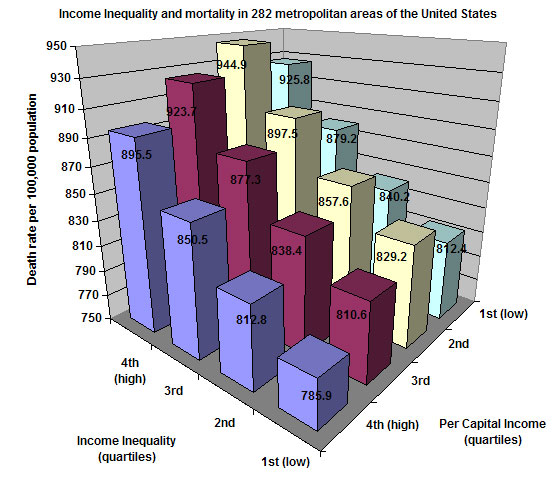
This shows death rates in metropolitan areas of the United States according to inequality of income and the average per capita income. This chart was created by Patrick Hayes using data from J. Lynch G.A. Kaplan, et al., "Income inequality and Mortality in Metropolitan Areas of the United States ," American Journal of Public Health 88 (1998): 1,074-80
I hereby release this image into the public domain.
Licensing
File history
Click on a date/time to view the file as it appeared at that time.
| Date/Time | Thumbnail | Dimensions | User | Comment | |
|---|---|---|---|---|---|
| current | 20:32, 2 December 2005 | | 559 × 488 (73 KB) | Kodemizer (talk | contribs) | This shows death rates in metropolitan areas of the United States according to inequality of income and the average per capita income. This chart was created by myself using data from J. Lynch G.A. Kaplan, et al., "Income inequality and Mortality in Metro |
You cannot overwrite this file.
File usage
The following pages on the English Wikipedia use this file (pages on other projects are not listed):