m Marking 2 sections stale; archiving 0 stale sections and 0 resolved sections. |
→Panorama of Maiden Castle: new request |
||
| (One intermediate revision by the same user not shown) | |||
| Line 879: | Line 879: | ||
{{I take|name}}: when you accept the request ; |
{{I take|name}}: when you accept the request ; |
||
{{Done}}: when the request is done. --> |
{{Done}}: when the request is done. --> |
||
==Panorama of [[Maiden Castle, Dorset|Maiden Castle]]== |
|||
<center><gallery> |
|||
File:Maiden Castle interior panorama.jpg|A panorama of the interior of Maiden Castle |
|||
</gallery></center> |
|||
'''Article(s):''' [[Maiden Castle, Dorset]] |
|||
'''Request:''' The article is currently a [[Wikipedia:Featured article candidates/Maiden Castle, Dorset/archive1|Featured Article candidate]] and an editor has commented that the image needs the colours tweaking. At the moment, it's very clear that the panorama is several different images stuck together and the different light levels is a bit distracting. I uploaded this from flickr and don't have the originals as I didn't take them. If anyone could help out it would be very much appreciated. Cheers, [[User:Nev1|Nev1]] ([[User talk:Nev1|talk]]) 17:01, 20 June 2009 (UTC) |
|||
'''Graphist opinion:''' |
|||
Revision as of 17:02, 20 June 2009
This page is deprecated and will not be monitored. Please use one of the three workshop pages. This specific page is {{{1}}}
Oman
-
 PNG map of Oman, and its location relative to the rest of the world.
 -
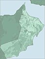 JPG detailed map of Oman, showing its exlaves
 -
 SVG with enclaves


Article(s): Oman
Request: The first map doesn't show Oman's two exclaves (areas of Oman within the United Arab Emirates. Could the map (a) be modified to show these areas, and (b) be converted to an SVG? The second map can be used to determine the location of the exclaves. For bonus points, the second map is a JPEG and could really do with being converted to an SVG - but now I'm just pushing my luck ;-) I don't know if it's relevant, but the first map comes from Commons - commons:File:LocationOman.png- if I need to make the request there let me know (I've watchlisted this page, or you can ping me on my talk page. Cheers, This flag once was redpropagandadeeds 14:36, 6 April 2009 (UTC)
Graphist opinion: There's an SVG version of the location map, it will need to be shown I'd guess at least at 700-800px for both the enclaves to be visible.--Goldsztajn (talk) 01:56, 8 April 2009 (UTC)
- Awesome! I think that so long as a user clicking on the map (and seeing an enlarged version) can see the exclaves then that should be fine. Thanks for your work on this, it's appreciated. Cheers, This flag once was redpropagandadeeds 14:37, 8 April 2009 (UTC)
- I've made the nominal size larger (from 600px to 1000px), this way one click to the image will reveal the external territories (rather than having to click and zoom).--Goldsztajn (talk) 01:14, 9 April 2009 (UTC)
- Thanks, Goldsztajn! This flag once was redpropagandadeeds 18:09, 9 April 2009 (UTC)
- Apologies, but moving final comment, seems that DyceBot is not reading this as resolved and suspect because of extra comments in tag.--Goldsztajn (talk) 02:01, 19 May 2009 (UTC)
- Thanks, Goldsztajn! This flag once was redpropagandadeeds 18:09, 9 April 2009 (UTC)
- I've made the nominal size larger (from 600px to 1000px), this way one click to the image will reveal the external territories (rather than having to click and zoom).--Goldsztajn (talk) 01:14, 9 April 2009 (UTC)
University of Oslo seal
-
 Seal of the University of Oslo (1842)
 -
 SVG seal with text on curve (does not render)


Article(s): University of Oslo
Request: File:Seal_of_the_University_of_Oslo.jpg is from 1842 and in the public domain, but in very low quality. If someone could redraw it in better quality, without background, it would be great - a free version of the university seal, that can be uploaded to Commons and used on other projects which do not allow fair use, would be greatly appreciated. The seal shows Apollo with the Lyre, and the text is "UNIVERSITAS REGIA FREDERICIANA". Also see the modern (non-free, fair use) version here (but the new image should be based on the free 1842 version). JY890 (talk) 00:11, 30 April 2009 (UTC)
Graphist opinion: Quality is too low. Any higher quality links/scans possible? JaakobouChalk Talk 00:52, 10 May 2009 (UTC)
- A better quality version of the free 1842 version isn't available, but check out this drawing of the seal, used in a 1926 Festschrift, which is almost the same. A redrawed version doesn't have to be 100 % identical to the 1842 version, the important thing is the motive (Apollo with the Lyre), and the text UNIVERSITAS REGIA FREDERICIANA. JY890 (talk) 21:38, 10 May 2009 (UTC)
- Would have it finished, if text on paths was supported for SVG. Can't be bothered to position every letter separately. Would a png do? OrangeDog (talk • edits) 21:34, 28 May 2009 (UTC)
- I'll add the letters if you would upload. --Blacklemon67 (talk) 20:55, 30 May 2009 (UTC)
- Would have it finished, if text on paths was supported for SVG. Can't be bothered to position every letter separately. Would a png do? OrangeDog (talk • edits) 21:34, 28 May 2009 (UTC)
- Thanks for the great work so far. Now only the letters need some adjustment (the letters are visible at [1], but does not render when included in articles. The text should be moved a little to the right, with "Regia" on the top. Btw., could future versions by uploaded to commons.wikimedia.org rather than en.wikipedia? JY890 (talk) 19:56, 7 June 2009 (UTC)
- I uploaded a png version at commons (File:University of Oslo seal 1842.png) to be used in articles for the time being. It possibly has a white background, I don't know how to make it transparent. JY890 (talk) 00:22, 8 June 2009 (UTC)
- I uploaded a png Transparent Background version of this image at commons. (File:University_of_Oslo_seal_1842_Transp_bkgnd.png)
--Dreamweaver3959 (talk) 04:43, 11 June 2009 (UTC)
Make the background trasparent
-
 Mask for composite icons
 -
 Alternate (non-mask) ball


Article(s): Huge number of link
Request: Could someone please make this file transparent, File:Soccerball mask.svg ? As for the soccerball, I want the background to be transparent because it take up spaces. If it can't be transparent, maybe any of you can help me to cut a bit the white background so that it fits the soccerball size. The file is from commons, and if any of you know any help pages that you think you can forward this question to, fell free to do it. Arteyu ? Blame it on me ! 10:21, 15 May 2009 (UTC) I think you doesn't have to make it trasparent, better to cut a bit the white background so that it fits the soccerball size, do not make it transparent. Thanks Arteyu ? Blame it on me ! 22:21, 15 May 2009 (UTC)
Graphist opinion: While I can't help with this request myself, I should point out that this template is used in {{Soccer icon}} which is in turn used in a multitude of stub templates. The background cannot be transparent because the ball is, and trimming too much of the whitespace may have an adverse effect. However, I do agree that the template is less than perfect; while it may prevent the need to have individual icons for each and every country, the end result is rather more cumbersome than an individual icon would be. PC78 (talk) 14:33, 16 May 2009 (UTC)
- It's okay if it cannot be done. But the image just take up so much spaces. I hope that some of you can figure out how a new file can be made without taking up spaces (that can replace this one that is being used on stubs. Thanks anyway (: Arteyu ? Blame it on me ! 17:01, 16 May 2009 (UTC)
- There's a soccer ball already avaliable with a transparent background, no shading on the ball. It looks like it was shaded previously, then reverted. gringer (talk) 02:49, 25 May 2009 (UTC)
- BTW, if you're interested in how this mask soccer ball is used, see one of the linked pages. gringer (talk) 02:51, 25 May 2009 (UTC)
- Yeah, thanks for the helpful information Arteyu ? Blame it on me ! 10:58, 26 May 2009 (UTC)
- I don't see why a little of the white space can't be trimmed off the sides. Looking at the pages it is used on you can see that, unlike other stub icons, it appears a little further to the left. Should be simple to just trim some off the sides, nothing fancy.75.93.119.255 (talk) 13:38, 14 June 2009 (UTC)
- Yeah, thanks for the helpful information Arteyu ? Blame it on me ! 10:58, 26 May 2009 (UTC)
The original map in JPEG is wrong
-
 Penang state map

Article(s): Penang
Request: Hi! It's me again. I just want to point out that the location name for the file above is wrong. Firstly, the island part of the state is not called "Pulau Penang" as in the map. The actual name of island part is "Pulau Pinang" (in Malay) or "Penang Island" (in English). The peninsular part of the state is known as "Seberang Perai", not "Penang" as stated in the map. The state as a whole is known as "Penang" in English. Another mistake that I've seen in the map is with the name of the capital of Penang. It should be "Georgetown", doesn't have any spaces between the "George" and the "Town" word.
My request is to create two map similar to that in PNG or SVG with no road lines (the lines in white and gray).
First map in detail: To create a new Penang map with no location names (no font at all & no road lines). If can don't make it black and white. Make it in colour. Also, I don't want the compass (the North locator or whatever you call it to be in the map).
Second map in detail: To create a new Penang map with location names (only state the Penang Island part, the Seberang Perai part and the George Town capital). Also, if can don't make it black and white. Make it in colour.
And if possible can you also make a map showing only the Penang island? I want to put it on this article — Penang Island.
That's all, thanks (: Arteyu ? Blame it on me ! 19:43, 16 May 2009 (UTC)
Graphist opinion: Making an attempt at this now. --James Chenery (talk) 19:42, 23 May 2009 (UTC)
- Thank you. At last there is someone Arteyu ? Blame it on me ! 06:55, 25 May 2009 (UTC)
- I have made a start on this request, and will try to finish it this week.--James Chenery (talk) 18:00, 2 June 2009 (UTC)
- Thank you. At last there is someone Arteyu ? Blame it on me ! 06:55, 25 May 2009 (UTC)
Indian National Congress flag
-
Flag of the Indian National CongressFlag of the Indian National Congress
Article(s): Indian National Congress
Request: The current image has got all the proportions of the hand election symbol of the Congress wrong. In fact, it looks like it was drawn by a small child. Please try to improve the image by using a reference image found here which itself is taken from the party's manifesto that can be found at the party website, so speaks rohith. 20:17, 19 May 2009 (UTC)
Graphist opinion(s): It looks like you want the hand bigger right? I don't see any obvious errors with the hand itself but rather how large it is. I'll take a stab at it, but this is my first time, so bear with me.75.93.119.255 (talk) 13:44, 14 June 2009 (UTC)
- Forgot to sign in. Anyway, I'm not sure if the versions you are posting are the correct ones. I'm finding on google alot that support the current version.Drew Smith What I've done 13:50, 14 June 2009 (UTC)
Dublin, Ireland GFX
-
 Flag of Dublin
 -
 Location of Dublin
 -
 Flag of Dublin, two towers burning (variation)
 -
 Use the harp from here


Article(s): Dublin
Request: Convert to SVG Connormah (talk) 21:50, 19 May 2009 (UTC)
Graphist opinion(s):Seems there is a different Dublin flag in Commons also available, however this one has two towers burning rather than three and a very different green. Some clarification on this issue would be helpful.--Goldsztajn (talk) 08:41, 22 May 2009 (UTC)
- I also found a SVG of the harp, I'll add it to the gallery above. Connormah (talk) 22:13, 23 May 2009 (UTC)
- Please see if you can find clarification on the colours and towers. Thanks. --Goldsztajn (talk) 23:02, 23 May 2009 (UTC)
Millennium '73
Graphist opinion(s):
-
 Border removal/cleanup
 -
 Version with border removed
 -
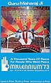 Jpeg artifacts/damage/creases


Article(s): Millennium '73
Request: As requested at Wikipedia:Featured_article_candidates/Millennium_'73/archive2. Otterathome (talk) 10:15, 25 May 2009 (UTC)
- GrahamColm removed the borders from the Astrodome image. I'm not sure what other cleanup is required. Will Beback talk 22:15, 25 May 2009 (UTC)
Graphist opinion(s): I've cleaned up the poster image as much as possible, removed noise & JPEG artefact. There isn't really much more that can be done to improve it, considering it started at a low quality. Tango22Talk 22:16, 09 June 2009 (UTC)
ABC 1957 logo

Article(s): American Broadcasting Company logos, Ozark Jubilee
Request: Convert to SVG. I would but I can't handle the different font. --Blacklemon67 (talk) 20:48, 30 May 2009 (UTC)
Graphist opinion:
Coat of Arms Requests
-
 Burkina Faso COA
 -
Benin COABenin COA
-
Cote d'Ivoire COACote d'Ivoire COA

Article(s): Burkina Faso, Cote d'Ivoire, Benin
Request: Please vectorise. Connormah (talk) 17:21, 31 May 2009 (UTC)
Graphist opinion(s): Here you go! Sodacan (talk) 22:19, 3 June 2009 (UTC)
- Thanks, Sodacan! The others would be great if they can be done, but if not, thats fine. Thanks again! Connormah (talk) 01:51, 4 June 2009 (UTC)
-
 Coat of Arms of Cote d'Ivoire from 2002 onwards

Simple request.
-
Yemen COAYemen COA
Article(s): Yemen
Request: Reduce stroke, and, the sides look a bit grainy, can it be fixed? Thanks. Connormah (talk) 02:51, 1 June 2009 (UTC)
Graphist opinion(s):
Spanish East Indies

Article(s): Spanish East Indies
Request: English language variant, clean so doesn't look like photocopy from a text... Chris (クリス • フィッチュ) (talk) 13:04, 1 June 2009 (UTC)
Graphist opinion:
Canadian Election Maps
-
 2006 Canadian Federal Election
 -
 2nd image (If there is one)
 -
2004 Canadian Federal Election2004 Canadian Federal Election
-
2000 Canadian Federal Election2000 Canadian Federal Election
-
1997 Canadian Federal ELection1997 Canadian Federal ELection


-
 Base off this file
 -
 Base off this file


Article(s): 2006 Canadian Federal Election, 2004 Canadian Federal Election...etc.
Request: Please make SVGs of the PNGs listed above using the SVG files for a template thst I have provided above. Thanks. Connormah (talk) 00:18, 2 June 2009 (UTC)
Graphist opinion(s):
4th Infantry Division DUI SVGify please?
-
 US Army 4th Infantry Division Distinction Unit Insignia
 -
 SVG
SVG


Article(s): 4th Infantry Division
Request: SVGify please? Thank you so much! - Jameson L. Tai talk ♦ guestbook ♦ contribs 16:00, 2 June 2009 (UTC)
- It looks awesome. Thank you so much! 163.118.222.98 (talk) 19:54, 3 June 2009 (UTC)
Graphist opinion(s):
![]() Done, how's this? Fvasconcellos (t·c) 20:56, 2 June 2009 (UTC)
Done, how's this? Fvasconcellos (t·c) 20:56, 2 June 2009 (UTC)
College seal and 2 logos


Article(s): Eastern Nazarene College
Request: Can these be made into .svg? I don't know how to do it myself. I tried learning, but I didn't understand and I don't think I have the right software. 74.240.161.84 (talk) 23:05, 2 June 2009 (UTC)
- That last image is no image; did you forget a .png or similar? Thanx, 76.117.247.55 (talk) 01:01, 3 June 2009 (UTC)
- I did. Sorry. Fixed. 74.240.161.84 (talk) 03:58, 3 June 2009 (UTC)
Zagreb Flab

Article(s): Zagreb
Request: SVG please. I attempted, but it is downright brutal. Connormah (talk) 03:27, 3 June 2009 (UTC)
Graphist opinion(s):
Passing the parameter
-
Indian National Highway 1Indian National Highway 1
Article(s): NH 1
Request: Can i know how to replace 1 with X ? And send the parameter from outside Naveenpf (talk) 13:29, 3 June 2009 (UTC)
Graphist opinion:
-
Indian National Highway 2Indian National Highway 2
- I need a parameter driven image.Thanx in advance--Naveenpf (talk) 03:37, 4 June 2009 (UTC)
- Template it. Create a template with text [[File:Image {{{1}}}.png|thumb|200px|blah blah]], then use the template. This requires, however, that you have for every (relevant) value of {{{1}}} a corresponding image. Shouldn't be too hard with SVG, just boring. MER-C 10:38, 4 June 2009 (UTC)
- I need a parameter driven image.Thanx in advance--Naveenpf (talk) 03:37, 4 June 2009 (UTC)
- That is really boring. any other option ? --Naveenpf 02:28, 5 June 2009 (UTC)
- What is it you want to do? Generate a set of images with a shield with the number on it? Or do you want to dynamically create such an image. I really don't understand the idea here. If you are doing this by yourself on your local computer, you can simply put a string in place of the X that won't appear up in the SVG, such as REPLACEME, then use Bash+sed/python/whatever to use regular expressions to solve your problem. If you can provide more background on the problem, then a solution might be available. User A1 (talk) 05:55, 8 June 2009 (UTC)
Coat of arms of Burma/Myanmar
-
 Coat of arms of Burma/Myanmar

Article(s): Burma, Government of Burma etc...
Request:
Main request: Make the background transparent.
Optional extra: Convert into an SVG. Obviously if it is made into an SVG then the background should be transparent anyway. Thanks--23230 talk 16:10, 3 June 2009 (UTC)
Graphist opinion:

- If you can, the text should probably be written (I know that's been done here before with the Algerine coat). 76.117.247.55 (talk) 23:34, 5 June 2009 (UTC)
Median arcuate ligament syndrome
-
 Generally pretty ugly.
 -
 Ditto.


Article(s): Median arcuate ligament syndrome (in my sandbox until I have some better diagrams)
Request: I drew these myself in Inkscape with zero knowledge of how to do this sort of thing, and well, the result makes that pretty clear. :-) I'd love if someone could clean these up a bit and output in SVG. I can provide additional (non-free) source images if the images I drew aren't clear enough. Thanks a ton. David Iberri (talk) 18:11, 3 June 2009 (UTC)
Graphist opinion(s): UTC)
- Visually, the pictures look fine; nice clean lines with not too much detail, just a little bit shaky on the finer scale of lines. If you drew these in Inkscape, where are the SVG files? It would be much easier to work from those. Something like clicking on the curves and simplifying (ctrl + l) would probably make them look better. Alternatively, change into node mode (F2), click on a node in a squiggly part of the picture, then delete the node (delete key). gringer (talk) 05:12, 4 June 2009 (UTC)
Ntv7


Article(s): Ntv7
Request: Can you convert both to PNG (or maybe SVG) with higher quality ? Also, please eliminate the background. I can't find a better logo from the search engine Arteyu ? Blame it on me ! 05:26, 4 June 2009 (UTC)
Graphist opinion(s):
Benghazi Mu'tamarat Sha'bia
-
 Map of administrative subdivisions in Benghazi

Article(s): Benghazi
Request: Please vectorise this JPEG image and make it SVG. External division lines should be thicker than internal division lines.Jaw101ie (talk) 09:47, 4 June 2009 (UTC)
Graphist opinion(s):
I've copied the following from my talk page, because it seems more relevant here gringer (talk) 01:35, 12 June 2009 (UTC):
Can you please have a look at my Benghazi Benghazi Mu'tamarat Sha'bia map on Wikipedia:Graphic Lab/Image workshop? It seems like it might have been forgotten? thanks a lot... Jaw101ie (talk) 06:53, 11 June 2009 (UTC)
- I'm not likely to work on this, as I have other things to do at the moment. However, I can offer a few suggestions as to why it isn't being snatched up by other people:
- This isn't a completely trivial vector conversion, due to JPEG artefacts and complex elements in your map.
- Doing this "properly" would require going back to official maps of the area, and the source is not hyperlinked in the original picture
- Some lines are smooth, others are jagged with sharp corners, and some have varying thickness (i.e. borders are unclear). This inconsistency doesn't seem like what was intended in the picture
- There is an overlap of a few line segments at the top of region 23, resulting in a cross shape, which is unlikely to be wanted in the final version
- There's usually no need to go back to user talk pages to ask for something on Wikipedia:Graphic Lab/Image workshop to be done, that's the point of the page. If you have an issue with something not being done, mention it on the Image workshop page, so that other people can understand your concerns. gringer (talk) 01:35, 12 June 2009 (UTC)
Yugoslav People's Army
-
File:JNA sign logo.gif
-

-

-
 Use these colors

Article(s): Yugoslav People's Army
Request: Vectorize (use the colors of the flag). PRODUCER (talk) 15:05, 4 June 2009 (UTC)
Graphist opinion(s):
Fixing line
-
 Road sign
 -
 SVG'd
SVG'd


Article(s): Hundreds of articles
Request: My request is quite easy, just fix the black lines & make it looks nicer. Don't convert it so SVG because it is being used in hundreds of articles. Arteyu ? Blame it on me ! 11:49, 5 June 2009 (UTC)
Graphist opinion(s): I think we should convert to SVG. Isn't there a bot that does the image changes? --Blacklemon67 (talk) 21:25, 5 June 2009 (UTC)
- It will be easier probably to convert it to SVG, and then if you like the new look, save it as a PNG. Also note that the reason it's used so many places is because it's used in templates like {{Malaysian Expressway System}}. It will be extremely easy to replace it with an SVG then; I've done similar things many times. 76.117.247.55 (talk) 23:31, 5 June 2009 (UTC)
- In that case, someone needs to do the changing --Blacklemon67 (talk) 00:01, 8 June 2009 (UTC)
- Hey, and there are 35 other file similar to that but I cant paste all of them here. Here's an example File:Mes-e2.png - only change the number "2" to other numbers 3,4,5,6...36 if you want to view it. It will be great if you can SVGify all of them. But i really don't think that it need to be SVGified because SVG image won't look good on thumbnail. I would consider you fixing the PNGArteyu ? Blame it on me ! 01:56, 8 June 2009 (UTC)
- If you're going to SVG this you might as well SVG all the ones linked on {{Malaysian Expressway System}}. — raeky (talk | edits) 03:01, 8 June 2009 (UTC)
- Isn't it possible to have SVGs with parameters? So [[File:Mae-e.svg|50px|E1|Test]] would yield
 --Blacklemon67 (talk) 11:11, 8 June 2009 (UTC)
- Isn't it possible to have SVGs with parameters? So [[File:Mae-e.svg|50px|E1|Test]] would yield
- Pls see the request Wikipedia:Graphic_Lab/Image_workshop#Passing_the_parameter--Naveenpf (talk) 10:17, 18 June 2009 (UTC)
- If you're going to SVG this you might as well SVG all the ones linked on {{Malaysian Expressway System}}. — raeky (talk | edits) 03:01, 8 June 2009 (UTC)
Biafra coat of arms
-
File:Biafra coat of arms.png
Article(s): Biafra
Request: color, other African coat of arms can be used for natural coloration... Chris (クリス • フィッチュ) (talk) 15:33, 5 June 2009 (UTC)
Graphist opinion:
Oklahoma City memorial panoramic shots
On a recent road trip, I took some pictures of the Oklahoma City National Memorial for use in this panorama. I thought it was pretty good, but when I nominated it at Wikipedia:Featured picture candidates/Oklahoma City memorial, people pointed out several stitching errors (as well as an overexposure). I'd like someone who's better with Hugin than I am to take another whack at this one. I have the original shots here.
I also have a second set of panoramic shots here if someone wants to stitch those together as well. Raul654 (talk) 20:28, 5 June 2009 (UTC)
Article(s): Oklahoma City National Memorial
Request: Stitch the two above sets together with a minimum of stitching errors. Correct the overexposed building, if possible. Raul654 (talk) 20:29, 5 June 2009 (UTC)
Graphist opinion: I get a 403 forbidden error when I try to access the images. --Blacklemon67 (talk) 21:29, 5 June 2009 (UTC)
- My bad. I've fixed it. Raul654 (talk) 21:35, 5 June 2009 (UTC)
- *Poke*. Anyone planning to do this one? Raul654 (talk) 07:10, 17 June 2009 (UTC)
- I think unless the pictures was taken with a proper pano-head then it's nearly impossible to put back together without some stitching errors. Secondly the overexposed building is forever lost, once the detail is blown out you can't get it back. If you shot in RAW that might be different. — raeky (talk | edits) 15:00, 17 June 2009 (UTC)
- *Poke*. Anyone planning to do this one? Raul654 (talk) 07:10, 17 June 2009 (UTC)
King's Highway (Charleston to Boston)
-
 Map of the King's Highway (Charleston to Boston)

Article(s): King's Highway (Charleston to Boston)
Request: This very rough map was clipped from a pdf. I'd like to get a map for the article that is PD and have it loaded to the commons. See File:W-RSimpleMap.gif or File:BPR NY map.png for a similar map. Many thanks Philly jawn (talk) 21:30, 14 June 2009 (UTC)
Graphist opinion(s):
Yugoslavia

Article(s): Yugoslavia
Request: Convert to SVG and use a updated style like in the second image. PRODUCER (talk) 17:12, 9 June 2009 (UTC)
Graphist opinion(s):
Transparent background
Article(s): Penang FA
Request: Make the logo background transparent. Thanks Arteyu ? Blame it on me ! 09:07, 10 June 2009 (UTC)
Graphist opinion(s):
![]() Request taken by Quasar Jarosz.
Request taken by Quasar Jarosz.
- How is that? Quasar (talk) 13:31, 10 June 2009 (UTC)
- Yeah, that looks great. Thanks pal (: Arteyu ? Blame it on me ! 05:35, 11 June 2009 (UTC)
- Well, it got removed for being non-free and linked from a page that isn't an article (is there no exception for this type of work?) but the updated version is still there. Quasar (talk) 15:01, 10 June 2009 (UTC)
- What do you mean by not linked to any appropriate article ? Yes, I agree that the Penang FA page isn't referenced but still qualify under WP:N. And why do you totally remove the File link above, should put the NFCC template instead Arteyu ? Blame it on me ! 05:35, 11 June 2009 (UTC)
- It probably got removed because it was at Commons. All non-free images should stay here. ZooFari 17:05, 10 June 2009 (UTC)
Clearing the circuit backlog
Article(s): All in Zobel network.
Request: I'll give a barnstar to the one(s) who clear this category up (12 images in total). Convert to SVG, upload at commons (but keep the rasters here as requested by the uploader), and update the articles they are in. They are simple lines that are very easy to do (I could do them myself but I'm quite busy), however, please don't trace bitmap these. Feel free to ask me questions. ZooFari 20:38, 12 June 2009 (UTC)
Graphist opinion(s): I can do some. Connormah (talk) 04:07, 13 June 2009 (UTC)
- Alright, here's an example of one. How does it look? I'll get to the others ASAP. Connormah (talk) 04:32, 13 June 2009 (UTC)
- I just found out that some are already done. I'll do the ones that haven't. Connormah (talk) 04:51, 13 June 2009 (UTC)
- Looks good, but there seems to be a line error in both of them. Maybe it is just the thumb, but the line looks shifted (near the humps). Also, it would be pleasant if you can update the ones you didn't do in the articles. ZooFari 04:53, 13 June 2009 (UTC)
- ZooFari, the line shifts were in the original PNGs... I couldn't tell if they were just lossy compression artifacts, or what not, so I'll wait for a word on that. It wouldn't be that hard to fix, though. I'll get them into articles once I finish. --Connormah (talk) 04:57, 13 June 2009 (UTC)
- Well that's awkward. Keep them for now. The other images seem to have them too, and somewhat seems it was meant on purpose. Also, I was referring to the SVGs you didn't make. If they aren't updated in the articles, I'd like those updated too. Thanks for the work, I'm too busy to vector them myself. ZooFari 05:04, 13 June 2009 (UTC)
- ZooFari, the line shifts were in the original PNGs... I couldn't tell if they were just lossy compression artifacts, or what not, so I'll wait for a word on that. It wouldn't be that hard to fix, though. I'll get them into articles once I finish. --Connormah (talk) 04:57, 13 June 2009 (UTC)
- Looks good, but there seems to be a line error in both of them. Maybe it is just the thumb, but the line looks shifted (near the humps). Also, it would be pleasant if you can update the ones you didn't do in the articles. ZooFari 04:53, 13 June 2009 (UTC)
- I just found out that some are already done. I'll do the ones that haven't. Connormah (talk) 04:51, 13 June 2009 (UTC)
- I was already converting the first three images (Zobel*.svg, not listed below) when this request appeared. After discussion with Spinningspark I think we have acceptable versions of those images now. They're hand-coded, in case anyone wishes to use them as templates for the others. Note that the subscripts only work in certain browsers, e.g. Opera and IE+ASV; all text appears on the baseline in Firefox[3] and even Inkscape. Certes (talk) 12:32, 13 June 2009 (UTC)
- Hi, thanks for the work you are doing on this guys, and my apologies for the mess on this article. It was created in three waves using different graphics tools each time, (slowly getting better). I no longer have professional design tools available (I no longer do that kind of work) and it took a while for me to acquire the right toolkit for internet work. However, I have reverted the latest batch, I did not think they were acceptable. Can I suggest that you template the updates on one of the more recent, better, diagrams in the article such as File:Bridge T with non-ideal inductor.svg? The resistors are zig-zag US style instead of boxes. SpinningSpark 13:16, 13 June 2009 (UTC)
- Shall I take a look at the rest of the PNGs or is someone else tackling them? File:Bridge T with non-ideal inductor.svg looks great but a bit large at 41KB. By the way, I always thought of the zig-zag resistors (with three points each way) as a global standard, with the box style as a valid but old-fashioned alternative. UK magazine Everyday Electronics used zig-zags since 1971 and its successor Everyday Practical Electronics still does. Which symbol do we want for impedances in Zobel network or don't we care as long as it's consistent? Certes (talk) 15:33, 13 June 2009 (UTC)
- If it's too large there must be something unecessary in there, just copy and paste the bits that are useful. The zig-zag is not a global standard, you have it the wrong way round, it used to be everyone used zig-zag but the official standard in Europe is now the IEC standard which uses a box. At least that was the case when I graduated (all the exams had boxes) and as far as I know nothing has changed since. However, zig-zag is used in the US and is still widely understood (and even preferred) amongst engineers in the UK. I started off doing Wikipedia diagrams with resistor=boxes, because I assumed that was the global standard, until I realised that was confusing many Americans. Since I actually prefer the zig-zags and since the era I write about uses those symbols it seemed sensible to me to change to zig-zag. There is no reason that Wikipedia should standardise on one region's standards. This has been discussed at Wikipedia Electronics but the consensus was that they don't much care and are not going to impose a standard of their own. This does not apply to the first two diagrams you did by the way, which are impedances (Z), not resistances (R), and it universally agreed that impedances should be boxes. SpinningSpark 16:58, 13 June 2009 (UTC)
- Thanks, I'll take a look at the other images now. As all the existing SVGs have zig-zag resistances, I'll draw mine that way. It seems a useful way to distinguish resistance from impedance within this article, even if it's not a universal convention. I'll put them on Commons and move my previous efforts 1 2 3 there too. Certes (talk) 18:02, 13 June 2009 (UTC)
- If it's too large there must be something unecessary in there, just copy and paste the bits that are useful. The zig-zag is not a global standard, you have it the wrong way round, it used to be everyone used zig-zag but the official standard in Europe is now the IEC standard which uses a box. At least that was the case when I graduated (all the exams had boxes) and as far as I know nothing has changed since. However, zig-zag is used in the US and is still widely understood (and even preferred) amongst engineers in the UK. I started off doing Wikipedia diagrams with resistor=boxes, because I assumed that was the global standard, until I realised that was confusing many Americans. Since I actually prefer the zig-zags and since the era I write about uses those symbols it seemed sensible to me to change to zig-zag. There is no reason that Wikipedia should standardise on one region's standards. This has been discussed at Wikipedia Electronics but the consensus was that they don't much care and are not going to impose a standard of their own. This does not apply to the first two diagrams you did by the way, which are impedances (Z), not resistances (R), and it universally agreed that impedances should be boxes. SpinningSpark 16:58, 13 June 2009 (UTC)
- Shall I take a look at the rest of the PNGs or is someone else tackling them? File:Bridge T with non-ideal inductor.svg looks great but a bit large at 41KB. By the way, I always thought of the zig-zag resistors (with three points each way) as a global standard, with the box style as a valid but old-fashioned alternative. UK magazine Everyday Electronics used zig-zags since 1971 and its successor Everyday Practical Electronics still does. Which symbol do we want for impedances in Zobel network or don't we care as long as it's consistent? Certes (talk) 15:33, 13 June 2009 (UTC)
- Hi, thanks for the work you are doing on this guys, and my apologies for the mess on this article. It was created in three waves using different graphics tools each time, (slowly getting better). I no longer have professional design tools available (I no longer do that kind of work) and it took a while for me to acquire the right toolkit for internet work. However, I have reverted the latest batch, I did not think they were acceptable. Can I suggest that you template the updates on one of the more recent, better, diagrams in the article such as File:Bridge T with non-ideal inductor.svg? The resistors are zig-zag US style instead of boxes. SpinningSpark 13:16, 13 June 2009 (UTC)
- I've now converted most of the images. Comments welcome, especially on:
- Spinningspark has kindly
offered to sendsent me data behind the three PNG graphs so these can be replicated more accurately and easily than by measuring the PNG. Unfortunately I will have limited time available for WP for the next week or so; please feel free to take over or wait until I return. Certes (talk) 15:57, 14 June 2009 (UTC)
-
 1
1 -
 2
2 -
 5
5 -
 6
6 -

-

-


Sport Current Event Icons
-
 Golf Current Event
 -
 Volleyball Current Event
 -
Baseball Current EventBaseball Current Event
-
 Basketball Current Event
 -
 Cricket Current Event
 -
 AFL Current Event


Refs:
-
 You may pull the basketball from here
 -
 You may refer to this tennis ball for the baseball one
 -
 Use the CE clock from here.


-
 Golf
Golf -
 Volleyball
 -
 Baseball
 -
 Basketball
 -
 Cricket
 -
 AFL
AFL -
 Squash
 -
 Curling
 -
 Hockey
 -
 Boxing
 -
 Swimming
 -
 Athletics
 -
 Lacrosse


Article(s): Template:Current sport
Request: Vectorize please. I'd prefer that the volleyball one is entirely redrawn (the volleyball) to fit with the nuvola style. You may use the images I have provided (SVGs) as references, or in the case (AKA the basketball) combine with the current event clock to make the icon. Thanks in advance! Connormah (talk) 03:57, 14 June 2009 (UTC)
Graphist opinion(s):
![]() Request taken by Pbroks13.
Will that work? --Pbroks13talk? 08:00, 15 June 2009 (UTC)
Request taken by Pbroks13.
Will that work? --Pbroks13talk? 08:00, 15 June 2009 (UTC)
- Wow, great! Arteyu ? Blame it on me ! 10:01, 15 June 2009 (UTC)
- Woah, thanks a bunch, Pbroks! Connormah (talk) 13:37, 15 June 2009 (UTC)
- Hm, one problem, though. Some of them aren't showing up in their pages for me. Is it just me, or is there some sort of problem? Connormah (talk) 13:41, 15 June 2009 (UTC)
- I'm not sure, everything is looking good to me. Maybe try purging your cache? --Pbroks13talk? 17:46, 15 June 2009 (UTC)
- Hm, one problem, though. Some of them aren't showing up in their pages for me. Is it just me, or is there some sort of problem? Connormah (talk) 13:41, 15 June 2009 (UTC)
- Woah, thanks a bunch, Pbroks! Connormah (talk) 13:37, 15 June 2009 (UTC)
- Wow, great! Arteyu ? Blame it on me ! 10:01, 15 June 2009 (UTC)
I had another similar request, can someone create a 'Squash current event' image? Arteyu ? Blame it on me ! 10:14, 16 June 2009 (UTC)
- Hows that? --Pbroks13talk? 19:36, 16 June 2009 (UTC)
- Awesome, I'll add it to the template. Pbroks, would you mind doing a curling one, with a black curling stone, with a yellow/red handle in nuvola? Thank you so much in advance. Connormah (talk) 01:14, 17 June 2009 (UTC)
- Wow, awesomeness, thanks pal (: Arteyu ? Blame it on me ! 07:06, 17 June 2009 (UTC)
- Awesome, I'll add it to the template. Pbroks, would you mind doing a curling one, with a black curling stone, with a yellow/red handle in nuvola? Thank you so much in advance. Connormah (talk) 01:14, 17 June 2009 (UTC)
Curling done. Good? --Pbroks13talk? 18:47, 17 June 2009 (UTC)
How about creating current image for popular and core sports such as athletics, boxing, hockey & swimming ? Another thing is, can you make the basketball image better or make it similar to the PNG, with better lines & gradients to suit template & pages? If not I think better to stick to the PNG because it looks better (although that it isn't scalable). Arteyu ? Blame it on me ! 10:03, 18 June 2009 (UTC)
- I don't know what you mean, but the basketball one is very similar to the PNG to me. BTW, could you make the curling stone handle a tad bit brightwer, as well? Thanks. Connormah (talk) 13:13, 18 June 2009 (UTC)
- Okay, I made the boxing one; the hockey one I already made before. I'll get to the swimming one later. Also, what do you mean by "athletics"? In regards to the basketball, what do you mean? The gradients match, so I'm kind of confused. --Pbroks13talk? 18:29, 18 June 2009 (UTC)
- Pbroks, if you can, may I request a lacrosse one as well? Connormah (talk) 19:36, 18 June 2009 (UTC)
- Thanks, the basketball image looks better now (: Ohh, athletics in this case refer to Track and field athletics, you can get take the image from here File:Athletics pictogram.svg. And Pbroks, can you also please fix the volleyball lines ? Thanks Arteyu ? Blame it on me ! 06:26, 19 June 2009 (UTC)
- Pbroks, if you can, may I request a lacrosse one as well? Connormah (talk) 19:36, 18 June 2009 (UTC)
+ swimming and athletics. --Pbroks13talk? 23:09, 19 June 2009 (UTC)
Stupid auto-archiver... >.< File:3 Infantry Div DUI.PNG -> SVG again
-
 3rd Infantry Division Insignia
 -
 SVG
SVG


Article(s): 3rd Infantry Division (United States)
Request: Properly SVGify this image please? Note a previous SVG was performed (see last request) and was poorly done. I {{tl}} the resolved template but the archiving bot apparently doesn't know to ignore those... - Jameson L. Tai talk ♦ guestbook ♦ contribs 08:19, 16 June 2009 (UTC)
Graphist opinion(s): Hows that? --Pbroks13talk? 01:36, 18 June 2009 (UTC)
- The bottom part looks like a tad bit of the circle is cut off, can that be fixed? — raeky (talk | edits) 01:53, 18 June 2009 (UTC)
- Oh sorry. Fixed. --Pbroks13talk? 04:22, 18 June 2009 (UTC)
- Theres like a light gray fill in all the "dragon" parts in the original png, the svg should reflect that. — raeky (talk | edits) 05:26, 18 June 2009 (UTC)
- Agreed, besides the light grey, it looks awesome! :) - Jameson L. Tai talk ♦ guestbook ♦ contribs 06:35, 18 June 2009 (UTC)
- I added the light grey. Is this okay? Connormah (talk) 23:21, 18 June 2009 (UTC)
Dwarf planet
-
PlutoPluto
Article(s): Dwarf planet
Request: Please make the outer (the round or the circle) shape looks better. It would also look better if you convert it to PNG and make the background transparet. Thanks Arteyu ? Blame it on me ! 11:33, 16 June 2009 (UTC)
- This request is similar to the File:Jww Birch.png Arteyu ? Blame it on me ! 10:07, 18 June 2009 (UTC)
Graphist opinion(s):
Yekaterinburg Coat of Arms
-
 Vectorize, please.
 -
 Use elements from this flag.


Article(s): Yekaterinburg
Request: Can someone vectorize the coat of arms using the elements from the flag? Thanks. Connormah (talk) 00:34, 17 June 2009 (UTC)
Graphist opinion(s):
Shrink fair-use image
-
 current fair-use image
Article(s): Order of the Stick, Characters of the Order of the Stick
Request: Found this fair-use image, needs to be shrunk (probably to about 66% of the current size...so far it is only used at about 50% of the current size, at least on my browser, but I guess some wiggle room should be left). Unfortunately, right now the only 'image editing' software I have is MS Paint, and this is a .gif; if I try saving as .gif in Paint it loses most of the color. Should be easy to shrink, though, for anyone who has photoshop. (Barring that, I could always just delete the whole thing and upload a .jpg version instead, since .jpg is no problem for me.) rʨanaɢ talk/contribs 15:18, 17 June 2009 (UTC)
Graphist opinion:
Hillary Clinton
-
 Hillary Clinton

Article(s): Hillary Clinton
Request: The article needs the background noise reduced so it can have a better chance at FP ... William S. Saturn (talk) 01:13, 18 June 2009 (UTC)
Graphist opinion(s):
Ntv7
-
Ntv7 logoNtv7 logo
Article(s): Ntv7
Request: Is it possible to fix this image? There are small light black lines between the grey that can be seen within the "7" word. There are also some on the other part of the image. Arteyu ? Blame it on me ! 10:22, 18 June 2009 (UTC)
Graphist opinion(s):
Seth Kinman's bar
-
 1889 photo of barroom interior

Article(s): Seth Kinman
Request: Black edge needs to be trimmed, can anything be done with the horizontal crack/fold in the middle? Window glare. The 3 chairs, Grizzly Bear head, and photo (upper right between the antlers) are all important to the image. Smallbones (talk) 16:42, 18 June 2009 (UTC)
Graphist opinion:
Temple plan
Article(s): Shin-Yakushi-ji
Request: Could a wikigraphist create two plans (or one) based on [4]? The first plan shows the temple grounds. Trees, water and the "WC" can be dropped. The second plan shows the main building. In the center of the main building there is a big sitting Buddha (Yakushi Nyorai) [5] surrounded by twelve standing statues. [6] A blank plan would do or I could help with the translation of the labels. bamse (talk) 16:46, 18 June 2009 (UTC)
Graphist opinion(s):
Royal Canadian Air Force COA
-
File:RCAF Badge.JPG
Article(s): Royal Canadian Air Force
Request: Please vectorize. Connormah (talk) 23:11, 18 June 2009 (UTC)
Graphist opinion(s):
US Infantry Badges
-
 13th Airborne Div. Patch
 -
File:5th Infantry Division.distinctive unit insignia.jpg
-

-
File:38 INF DIV.gif
-
File:42 INF DIV DUI.gif
-

-

-
File:2 Infantry Div DUI.PNG
-


Article(s): 5th Infantry Division (United States), 13th Airborne Division (United States), 24th Infantry Division (United States), 38th Infantry Division (United States), 42nd Infantry Division (United States) ......
Request: Please vectorize. Take your time, do them as you please. Thanks in advance. Connormah (talk) 23:31, 18 June 2009 (UTC)
Graphist opinion(s):
Nuvola Icons - Vectorize


![[1]](https://upload.wikimedia.org/wikipedia/en/d/d2/Apollo_seal.svg)
Article(s): Many
Request: Can these be vectorized? Thanks. Connormah (talk) 03:56, 19 June 2009 (UTC)
Graphist opinion(s):
Coat of Arms of Eritrea

Article(s): Eritrea
Request: Alright, I know this image is fair-use, but I think it needs to be converted to a vector. The quality of this image, I feel in innapropriate for Wikipedia and NEEDS a SVG. Thanks in advance to whoever does this. Connormah (talk) 23:07, 19 June 2009 (UTC)
Graphist opinion(s):
Flag of Burnaby, BC

Article(s): Burnaby
Request: Can someone clean this image up so it is less grainy? Connormah (talk) 00:28, 20 June 2009 (UTC)
Graphist opinion(s):
Panorama of Maiden Castle
-
 A panorama of the interior of Maiden Castle
Article(s): Maiden Castle, Dorset
Request: The article is currently a Featured Article candidate and an editor has commented that the image needs the colours tweaking. At the moment, it's very clear that the panorama is several different images stuck together and the different light levels is a bit distracting. I uploaded this from flickr and don't have the originals as I didn't take them. If anyone could help out it would be very much appreciated. Cheers, Nev1 (talk) 17:01, 20 June 2009 (UTC)
Graphist opinion: